Redefining Patient Engagement During Clinical Trial Research
Year: 2019
Role: Senior UX Designer
The Challenge
Imagine juggling a dozen tools, endless spreadsheets, and manual processes—all while trying to make meaningful connections with patients who are counting on you. That’s the reality healthcare professionals and research organizations were living with. Patient enrollment was clunky, milestone tracking was chaotic, and overall engagement felt like an afterthought. It was frustrating, overwhelming, and, quite frankly, broken.
Enter the Latitude Registry Platform, a solution designed to simplify workflows, bring people together, and give healthcare teams a holistic, tech-driven view of the patient journey. But this wasn’t just about fixing inefficiencies—it was about making a difference.
The first use case hit close to home: two migraine research foundations. We weren’t just designing for everyday challenges; we were building for patients who lived with debilitating, chronic migraines—people who couldn’t find relief anywhere else. Many of these patients volunteered for clinical trials out of sheer desperation, and that urgency fueled our work. This wasn’t just a project; it was a responsibility.
As the Senior UX Designer, I was determined to make this platform not just functional but intuitive, engaging, and deeply human.
The Journey
Listening to the People Who Lived It
The first step was simple: listen. We sat down with the people who knew the pain points best—investigators, site coordinators, healthcare professionals, and patients. In immersive workshops, they shared their worlds with us: the frustrations of manual processes, the chaos of disconnected tools, and the struggle to truly engage patients.
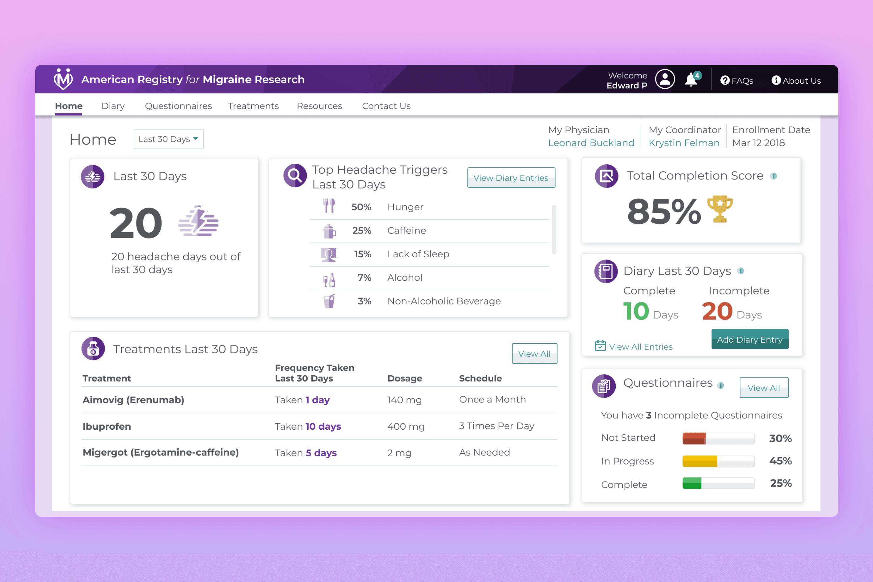
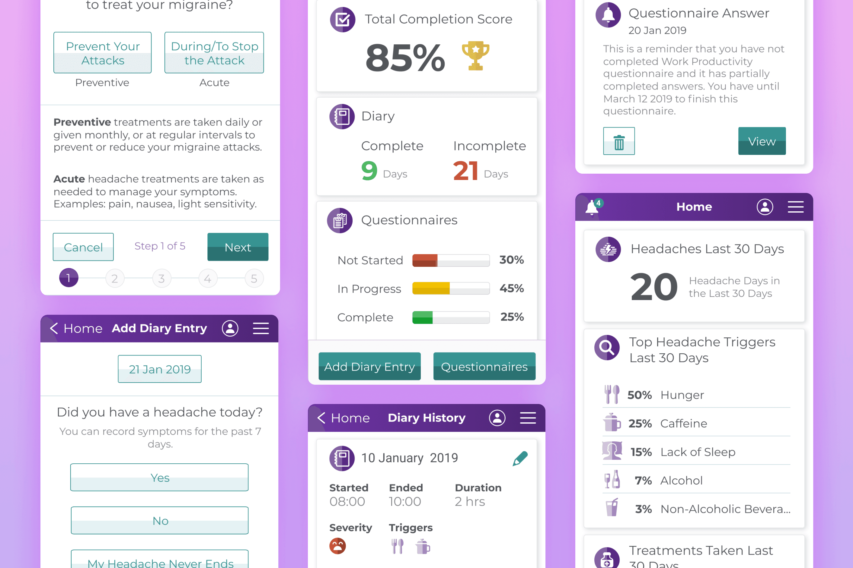
I co-facilitated these sessions with my UX Manager, making sure we dug deeper than surface-level feedback. The stories we heard were powerful—like how investigators were spending hours juggling spreadsheets instead of focusing on their patients. Or how patients, especially those in the migraine trials, struggled to keep up with daily diary entries and mandatory questionnaires, often sent manually through scattered systems. Missing these wasn’t an option, as they were critical for staying in the clinical trial, yet the process made it unnecessarily stressful for them.
By the end of these workshops, we had a clear, detailed map of what needed to change—and why it mattered.
From Feedback to Action
With our insights in hand, it was time to roll up our sleeves and design. My role was to guide the process, ensuring every solution we created was grounded in the reality of our users’ lives.
We started with wireframes and prototypes, collaborating closely with developers, analysts, and stakeholders. These weren’t just pretty mockups—they were tools for solving real problems. Investigators helped us identify clunky workflows, which we streamlined. Patients, especially those managing chronic migraines, emphasized the importance of automated, intuitive systems for managing their mandatory trial questionnaires. They wanted clear reminders, easy submission processes, and visibility into their progress, so we designed features to make keeping up with these requirements simple and stress-free.
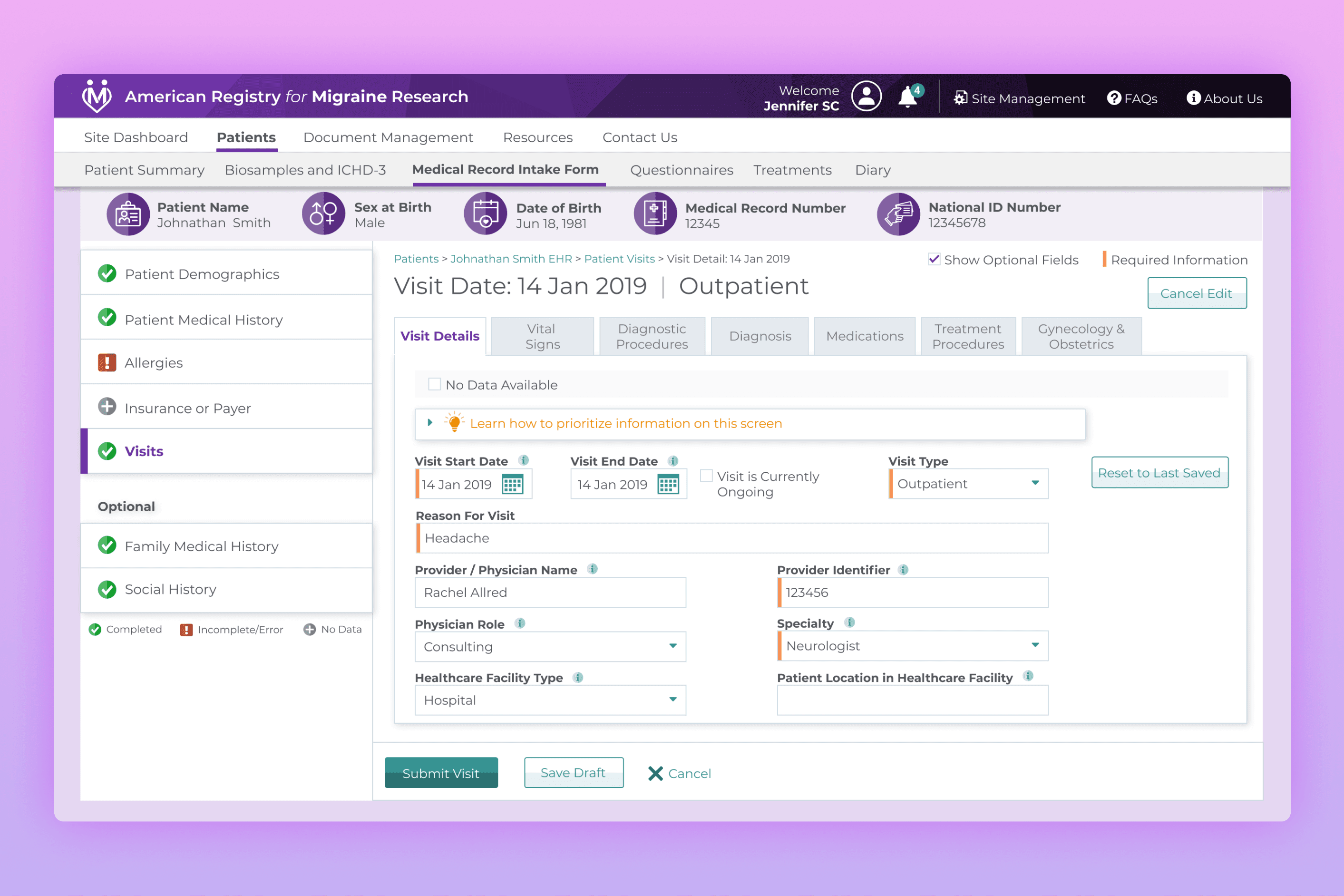
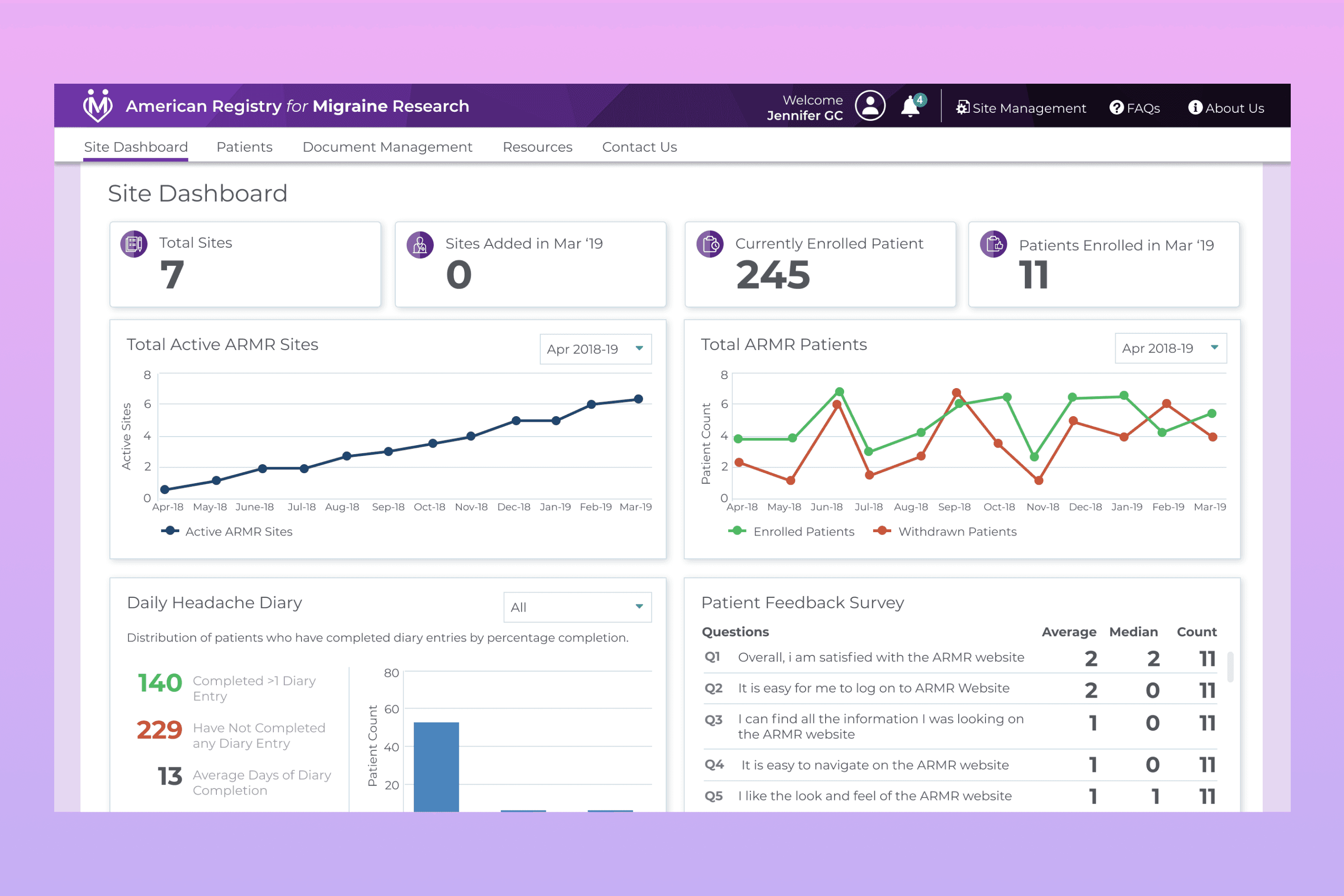
Recognizing the importance of flexibility for all users, we developed responsive applications tailored to their unique needs. For global and site coordinators, we designed a desktop and tablet application to provide flexibility in managing workflows and accessing data on the go. For patients, we created a desktop and mobile version of the platform, ensuring they could easily complete daily submissions and access key features—no matter where they were or which device they used.
This was an iterative process, full of feedback loops and constant improvement. I oversaw design reviews, mentored a junior designer, and worked closely with the team to balance user needs with technical realities. Every review, every prototype, brought us closer to a solution that felt not only practical but transformative.
Making Engagement Fun
One big challenge? Keeping patients engaged. Let’s be honest—filling out diary entries and completing questionnaires isn’t exactly thrilling. So, we turned to gamification.
We added progress tracking, completion scores, and even achievement badges. These little touches made participation feel rewarding, not tedious. For patients in the migraine trials, who were already navigating tough symptoms, these features added a layer of encouragement and positivity. And for researchers, it meant higher-quality data.
Laying the Foundation
Oh, and did I mention we were learning Figma from scratch while doing all of this? At the time, it was a brand-new tool, and my design lead and I dove in headfirst. We didn’t just learn it—we trained the team, documented patterns, and laid the groundwork for what would later become the ZS Design System.
The Results
By the end, we didn’t just build a tool—we created an experience.
For Investigators and Coordinators: Tailored Desktop and tablet portals streamlined their workflows, making their jobs easier and more efficient.
For Patients: A thoughtfully designed mobile app empowered them to actively participate in their care, making engagement feel simple and rewarding. For those in the migraine trials, it became a beacon of hope.
For Everyone: We turned disconnected processes into a cohesive, seamless platform that provided a 360-degree view of patient data.
The Latitude Registry Platform wasn’t just about solving problems—it was about creating connections. It made healthcare research simpler, more efficient, and, most importantly, more human. We turned a scattered, manual system into a tool that brought healthcare professionals and patients together in a meaningful way. This wasn’t just about solving a problem; it was about making healthcare research and engagement simpler, more efficient, and, most importantly, more human.