Unifying the ZS UX Team with a Scalable Design System
Year: 2018-2024
Role: UX Design Lead
The Spark of Necessity
By 2018, the ZS UX consulting team was rapidly expanding, transforming from a small group based in two offices into a global force tackling a diverse array of client projects. But with that growth came growing pains. Designs across projects lacked cohesion—multiple versions of buttons, inconsistent typography, and a mishmash of icons were just the tip of the iceberg. This lack of uniformity wasn’t just an aesthetic issue; it slowed us down and created inefficiencies when collaborating across teams.
The Journey
As the UX Design Lead, I took on the challenge of building a unified design system that would streamline workflows, improve collaboration, and bring consistency to our designs. This wasn’t just about creating pretty components—it was about crafting a toolset that would elevate our work and set a standard for excellence. My role was twofold: guiding the junior designers executing the work and managing the broader coordination efforts. I worked closely with my co-lead to handle project management tasks like staffing, budgeting, and planning, while also aligning with stakeholders, SMEs, build teams, and other design teams across ZS.
Laying the Foundation
I started with an extensive audit of all the components, patterns, and icons used in our projects. Partnering with a junior designer, I cataloged and analyzed everything we had, uncovering just how fragmented our visual language had become. To make sure the library addressed real needs, I conducted light internal research with our UX team, asking which components and icons they relied on the most. This feedback shaped our priorities, ensuring the library would serve as a valuable tool for everyone.
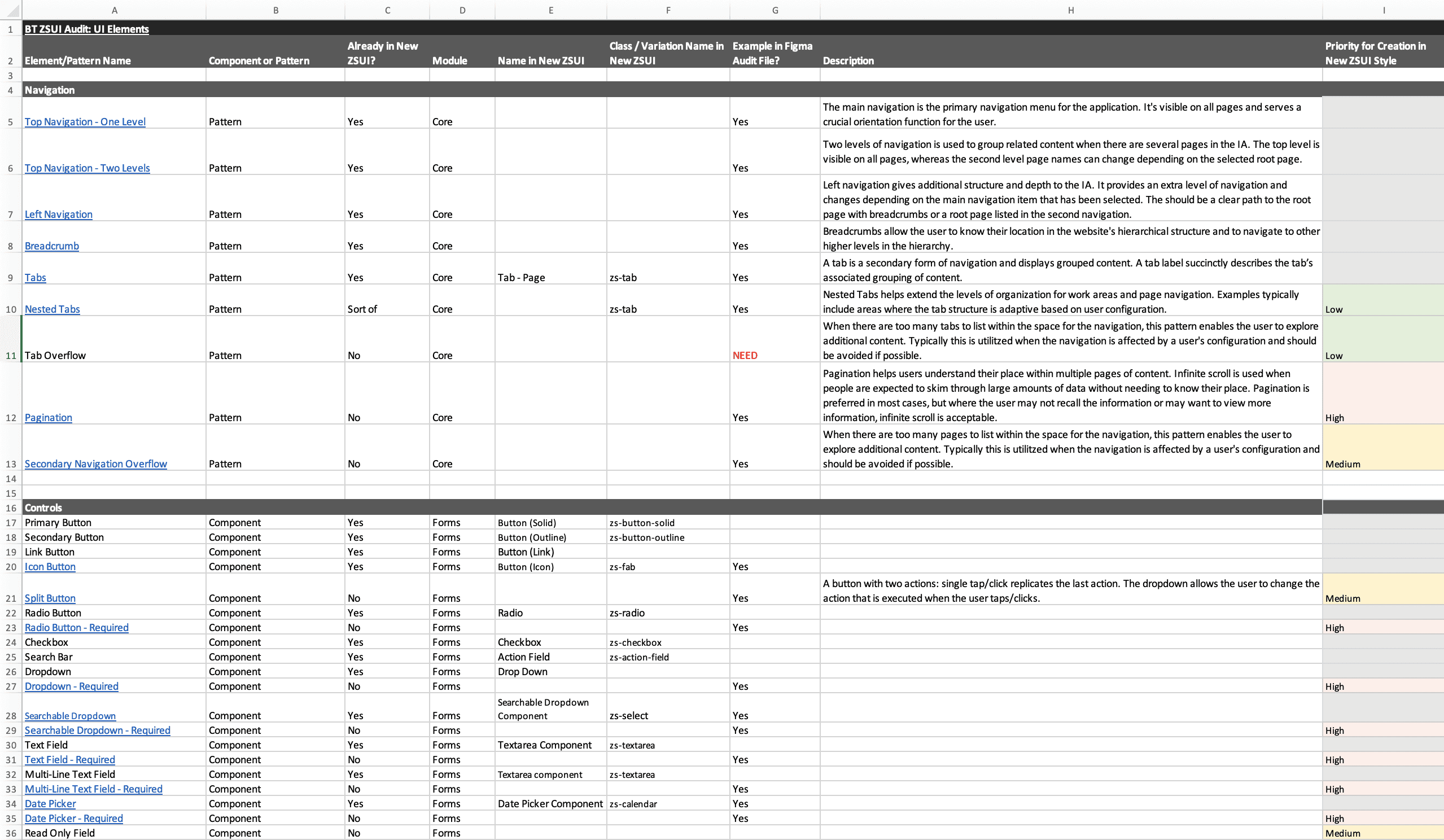
Every icon, chart, and UI element was logged and linked to examples for traceability—a meticulous but essential step.
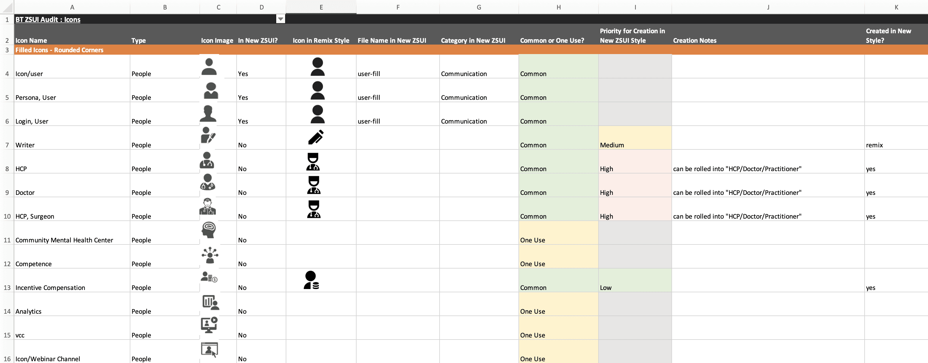
We often times had four or five different representations for the same icon type in multiple styles, causing major disconnects in the look and feel across projects.
My goal was to consolidate these insights into a scalable design library in Figma. The team aligned with the internal ZS product UX team’s guidelines to maintain consistency while tailoring elements to meet the unique demands of our client-facing projects. For example, some clients used highly customizable BI tools, while others required solutions that adhered to rigid technical constraints. To address this, we created variations of our component libraries tailored to these specific needs, facilitating seamless collaboration with the build teams. From navigating varied tech stacks to addressing platform-specific constraints, we built a system that was not only cohesive but also practical.
The Art of the Icon
One of the most ambitious parts of this project was reworking the icon library. I chose Remix, an open-source icon library, as the foundation, since it was already being used by the internal product team. However, at the time, Remix was a relatively new library and lacked many of the healthcare-specific icons needed for our team's consulting work. To address this gap, I created custom healthcare-related icons in two distinct styles: filled and stroke.
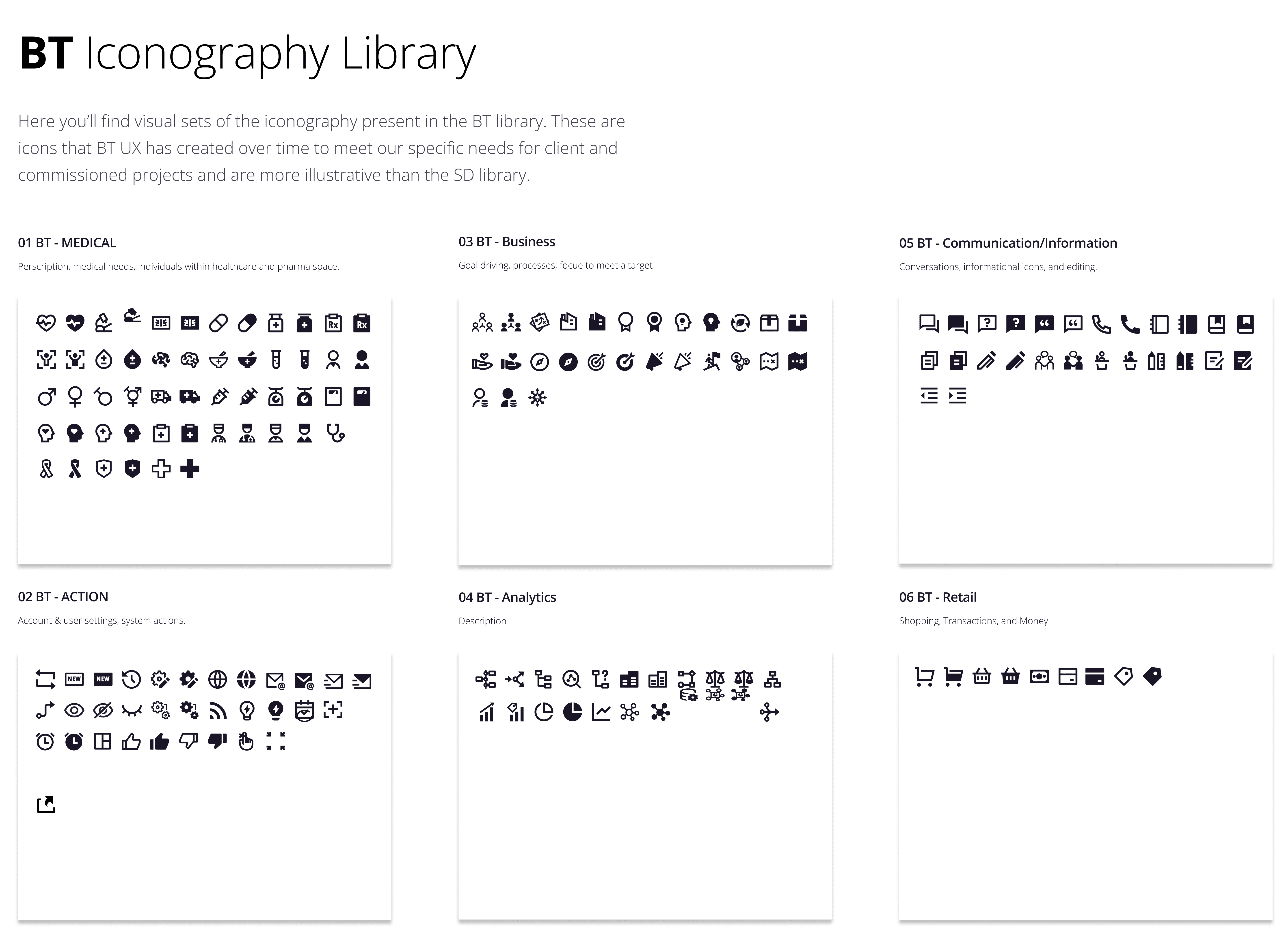
A sample of the many icons created, some of them custom built. We organized them by topic for easy location.
This decision wasn’t just about aesthetics; it was about creating flexibility for our team and ensuring our icons could adapt to the needs of various platforms and client preferences. Over time, Remix expanded their library significantly, making it easier to handle new icon requests. But those early days required a lot of creativity and persistence to bridge the gaps.
Ongoing Collaboration and Figma Training
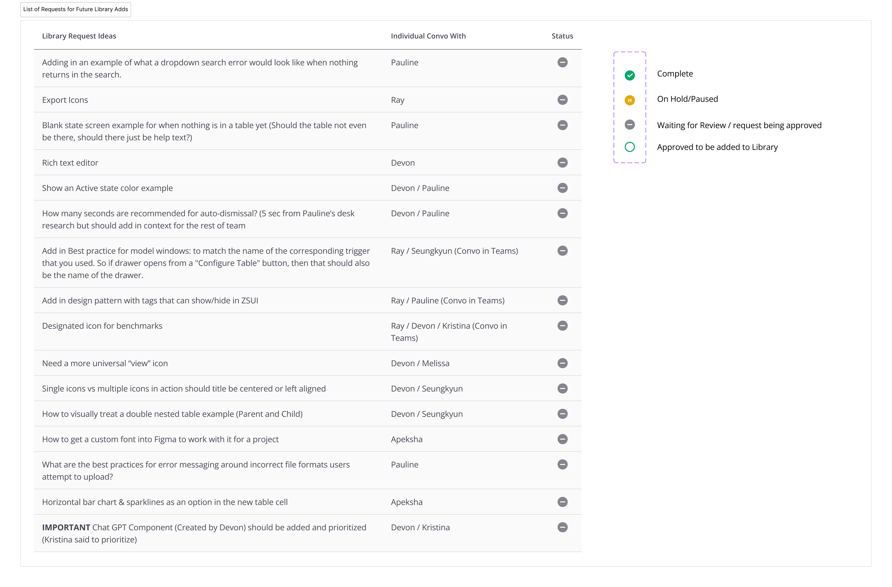
Once the initial library was created, our core team held semi-monthly meetings with the broader UX team to ensure the system continued to meet everyone’s needs. These sessions provided a platform for feedback on the components and icons—how they were built, what could be improved, and what new components were needed. We used this time to address concerns, prioritize requests, and keep the library evolving in a way that supported all projects.
Given the rapidly evolving nature of Figma as a tool, we also prioritized keeping the team up to date with its latest features. We provided training sessions on newly launched Figma capabilities, ensuring everyone understood how these updates could impact the design library and streamline their work. This ongoing education helped maintain a high level of efficiency and adaptability across the team.

Ensuring Accessibility
In recent years, accessibility has become a key focus for the design system. Some of our European clients face stringent WCAG accessibility guidelines starting in 2025, and ensuring compliance has been a critical priority. As someone with a personal interest in accessibility standards, this was an aspect of the project I found particularly rewarding.
I worked to integrate WCAG guidelines into every aspect of the design system. This included ensuring appropriate color contrast, keyboard navigability, and screen reader compatibility across components. For example, I introduced accessible color palettes and refined the typography for readability, considering users with visual impairments. This effort not only elevated the quality of our design system but also reinforced its global relevance. It has been fulfilling to dive deeper into accessibility standards and see our team create solutions that are inclusive and forward-thinking.
Overcoming Challenges
Building the ZS UX design system wasn’t without its hurdles. Budget constraints and the reality of balancing this initiative with the volume of client work that comes with management consulting meant we had to tackle the project in phases. Often, the team was working on the design system in the cracks of time between high-priority deliverables. The backlog of requests grew faster than we could clear it, and we had to make difficult choices about what to prioritize.
We also faced unique challenges in staying aligned with the internal product team. While they focused on creating standards for internal needs, we were dealing with external clients, which introduced additional demands. For instance, mobile standards were critical for our work, but the internal team hadn’t developed them yet. Rather than waiting, we took the lead, creating our own mobile guidelines to ensure our projects could keep moving forward.
The Results
The ZS UX design system became more than just a collection of components—it became a unifying force for our team. By consolidating and standardizing our design language, we:
Brought Consistency Across Projects: Whether we were working for a pharma client or a healthcare system, our work had a cohesive look and feel that aligned with the ZS brand.
Increased Efficiency: Reusable components meant we could design faster, focusing more on solving client problems rather than recreating the same elements repeatedly.
Facilitated Collaboration with Build Teams: Clear, consistent design specs made handoffs smoother and reduced friction during development.
Adapted to Client Needs: By tailoring components to specific tech stacks and platform limitations, we ensured our solutions were not only beautiful but also practical.
Ensured Accessibility: With WCAG-compliant components, we created a design system that is inclusive and prepared to meet the stringent standards of global clients.
Laid the Foundation for the ZS Design System: This initiative set the groundwork for what is now a cornerstone of ZS UX—a comprehensive system that continues to evolve and grow with the team.
As the UX Design Lead on the ZS UX design system initiative, I had the privilege of guiding junior designers, aligning cross-functional teams, and pushing forward a vision for a more unified, efficient way of working. This project wasn’t just about creating a design system—it was about building a framework that empowered our team to deliver exceptional, consistent work no matter the client, platform, or challenge.